Enhance your website’s mobile responsiveness with the top WordPress mobile plugins. Compare the best options for creating mobile-friendly sites, optimizing performance, and improving user experience.
Introduction
In today’s digital age, the majority of internet users access websites through mobile devices. This shift in browsing habits has made mobile responsiveness a crucial aspect of website design. A mobile-responsive site adjusts its layout and content to fit different screen sizes, providing users with an optimal viewing experience.

WordPress, as one of the most popular content management systems, offers a wide range of plugins to help make websites mobile-responsive. These plugins provide various features and functionalities to ensure that your site looks great and functions well on mobile devices. In this article, we will explore seven fantastic WordPress plugins that can help make your site mobile responsive, enhancing user experience and potentially boosting your SEO efforts.
Why Mobile Responsiveness Matters
The Rise of Mobile Browsing
Mobile devices have become the primary means of accessing the internet for a large portion of the population. According to Statista, as of 2021, mobile devices accounted for over 50% of web page views worldwide. This trend is expected to continue, highlighting the importance of ensuring that websites are optimized for mobile viewing.
Impact on User Experience
A mobile-responsive website provides a seamless and enjoyable browsing experience for users. Content is displayed correctly, images load quickly, and navigation is easy, regardless of the device being used. This positive user experience can lead to increased engagement and higher conversion rates.
SEO Benefits
Mobile responsiveness is a key factor in search engine optimization (SEO). Google, for example, considers mobile-friendliness as a ranking factor in its search algorithm. Websites that are not mobile-responsive may be penalized in search rankings, resulting in lower visibility and traffic.
Choosing the Right WordPress Plugins
Factors to Consider
When selecting plugins for mobile responsiveness, several factors should be considered. Compatibility with your WordPress theme is crucial, as some plugins may not work well with certain themes. It’s also important to choose plugins that are regularly updated and supported by their developers to ensure compatibility with the latest WordPress version and security patches.
Ease of Use
Look for plugins that are easy to use and configure, even for those with limited technical knowledge. The plugin should offer intuitive settings and options for customizing the mobile layout and design of your website.
Features and Functionalities
Different plugins offer various features and functionalities for improving mobile responsiveness. Some plugins focus on optimizing images and content delivery, while others provide mobile-specific themes or design elements. Choose plugins that best suit your website’s needs and goals.
Reviews and Ratings
Before installing a plugin, check reviews and ratings from other users. This can give you insight into the plugin’s performance, reliability, and any potential issues you may encounter.
The Best WordPress Mobile Plugins Options
1. WPtouch
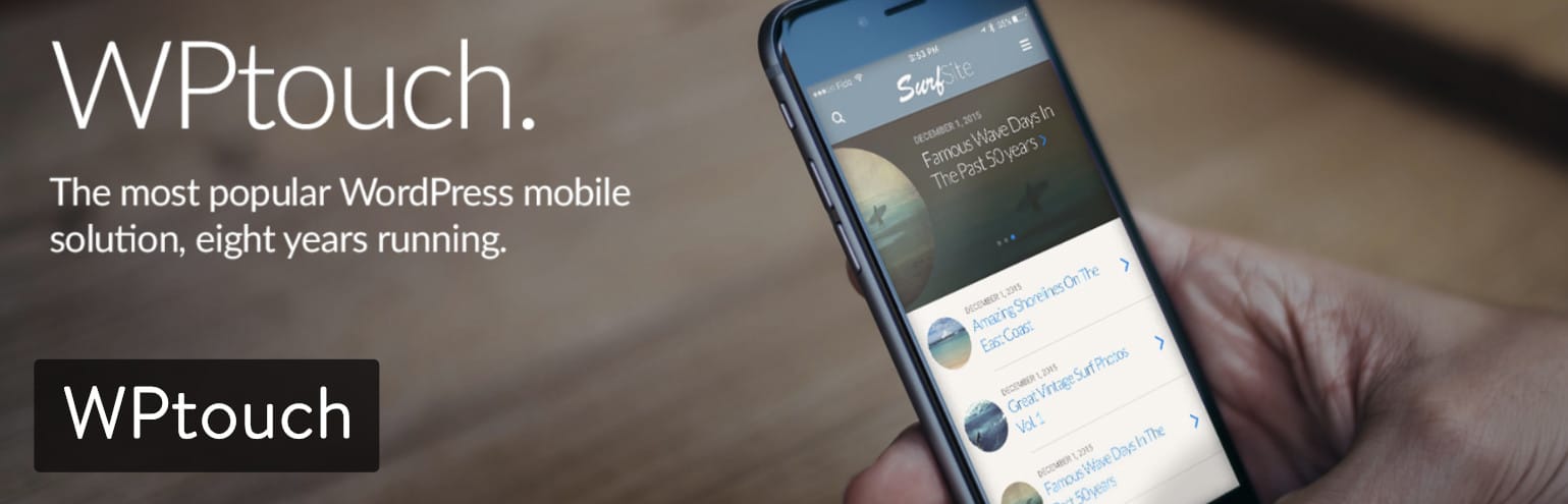
WPtouch is a comprehensive WordPress plugin designed to create a mobile-friendly version of your website with ease. It automatically enables a mobile-friendly theme when visitors access your site from mobile devices, ensuring a seamless and optimized browsing experience. WPtouch is highly customizable, offering a wide range of themes, color schemes, and design elements to match your brand identity.
Key Features:
1. Easy Setup and Configuration: WPtouch features a user-friendly interface that simplifies the setup and configuration process. Users can quickly customize the mobile theme to align with their website’s branding and design preferences.
2. Customizable Themes and Layouts: The plugin provides a variety of customizable themes and layouts, allowing users to create a unique and visually appealing mobile site. Users can choose from different design elements, color schemes, and typography options to create a cohesive brand experience.
3. Touch-Optimized Design Elements: WPtouch includes touch-optimized design elements such as buttons and navigation menus, ensuring that users can easily navigate the mobile site using touch gestures. This feature enhances the overall user experience and makes the site more accessible on mobile devices.
4. Compatibility with Various WordPress Themes and Plugins: WPtouch is compatible with a wide range of WordPress themes and plugins, ensuring seamless integration with existing website elements. This compatibility makes it easy for users to add mobile responsiveness to their site without disrupting their current setup.
5. SEO Benefits: By providing a mobile-friendly version of the site, WPtouch helps improve SEO rankings. Google considers mobile-friendliness as a ranking factor, so having a mobile-responsive site can lead to better search engine visibility and increased organic traffic.
6. Increased Mobile Traffic and Engagement: With a mobile-responsive site created by WPtouch, users are more likely to visit the site and engage with its content. The improved user experience on mobile devices can lead to higher conversion rates and increased user engagement metrics.
7. Performance Optimization: WPtouch optimizes your site’s performance on mobile devices by reducing load times and improving overall responsiveness. This can lead to a better user experience and higher search engine rankings.
2. AMP for WP – Accelerated Mobile Pages
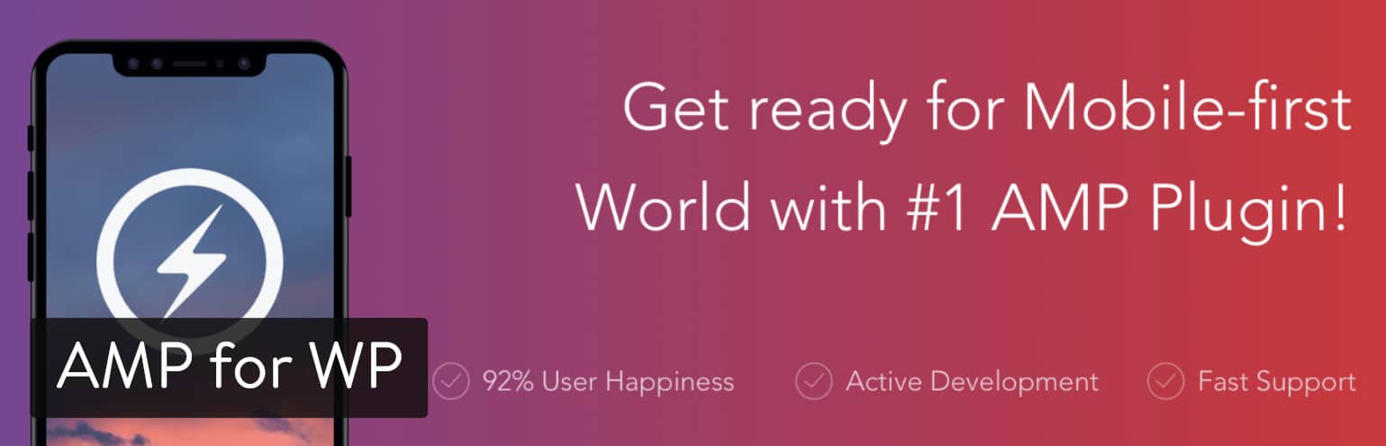
AMP for WP is a robust plugin that focuses on creating Accelerated Mobile Pages (AMP) for WordPress sites. AMP is a technology developed by Google that aims to improve the loading speed and performance of web pages on mobile devices. By implementing AMP on your site, you can provide users with a faster and more responsive mobile experience, which can lead to higher engagement and better SEO rankings.
Key Features:
1. Automatic Generation of AMP Pages: AMP for WP automatically generates AMP versions of your posts and pages, ensuring that they load quickly and efficiently on mobile devices.
2. Customizable AMP Templates: The plugin offers a range of customizable AMP templates, allowing you to design your AMP pages to match the look and feel of your website.
3. Built-in Support for Google Analytics and Adsense: AMP for WP includes built-in support for Google Analytics and Adsense, allowing you to track the performance of your AMP pages and monetize them with ads.
4. Compatibility with Various WordPress Plugins and Themes: The plugin is compatible with a wide range of WordPress plugins and themes, making it easy to integrate AMP into your existing website.
5. Improved SEO: AMP pages are favored by Google and often receive higher rankings in search results, leading to increased visibility and traffic for your site.
6. Enhanced Mobile Experience: By providing users with fast-loading AMP pages, you can significantly improve their mobile browsing experience, leading to higher engagement and lower bounce rates.
3. Jetpack by WordPress.com

Jetpack by WordPress.com is a popular plugin that offers a wide range of features to enhance the performance and security of your WordPress site. Among its many features are tools specifically designed to improve mobile responsiveness. Jetpack’s mobile theme feature automatically adapts your site’s layout for smaller screens, ensuring that it looks great and functions well on mobile devices.
Key Features:
1. Mobile-Friendly Themes: Jetpack offers a selection of mobile-friendly themes that are optimized for smaller screens. These themes ensure that your site looks great and is easy to navigate on mobile devices.
2. Image and Video Optimization: Jetpack automatically optimizes images and videos on your site for mobile devices, reducing load times and improving performance.
3. Lazy Loading: The plugin includes lazy loading for images, which means that images are only loaded when they come into view on the user’s screen. This helps reduce load times and improve the overall user experience on mobile devices.
4. Mobile Traffic Insights and Analytics: Jetpack provides insights into your site’s mobile traffic, including the number of visitors accessing your site from mobile devices and how they are interacting with your content. These insights can help you make informed decisions about your site’s mobile strategy.
5. Easy Setup and Configuration: Jetpack is easy to set up and configure, with a user-friendly interface that makes it simple to customize your site’s mobile settings.
6. Compatibility with Various WordPress Themes and Plugins: Jetpack is compatible with a wide range of WordPress themes and plugins, ensuring that it works seamlessly with your existing site setup.
4. WordPress Mobile Pack
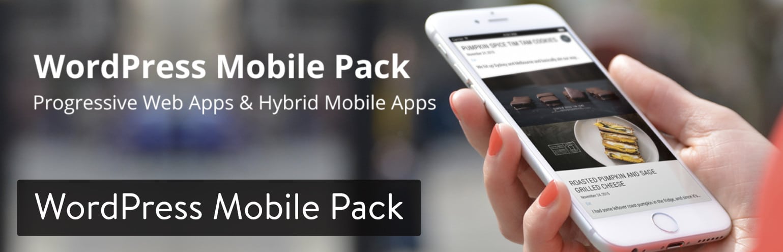
WordPress Mobile Pack is a comprehensive plugin designed to optimize your WordPress site for mobile devices. It offers a suite of features that allow you to create a mobile-friendly version of your website, ensuring that visitors using smartphones and tablets have a seamless browsing experience. The plugin is user-friendly, with easy setup and customization options that allow you to tailor the mobile experience to match your brand.
Key Features:
1. Mobile Switcher: WordPress Mobile Pack includes a mobile switcher feature that detects when a visitor is accessing your site from a mobile device and automatically switches to a mobile-friendly theme. This feature ensures that your site is optimized for smaller screens and touch interactions, providing a better user experience for mobile users.
2. Touch-Friendly Design Elements: The plugin offers touch-friendly design elements such as buttons and navigation menus, making it easy for users to navigate your site on touchscreens. These design elements enhance the user experience on mobile devices, encouraging visitors to engage with your content.
3. Mobile Analytics: WordPress Mobile Pack provides mobile analytics tools that allow you to track visitor behavior on your mobile site. You can see how many visitors are accessing your site from mobile devices, which pages they are viewing, and how long they are staying on your site. This data can help you make informed decisions about your mobile strategy and improve the overall user experience.
4. Customizable Mobile Themes and Layouts: The plugin offers customizable mobile themes and layouts, allowing you to create a mobile site that reflects your brand identity. You can choose from a range of pre-designed themes or create your own custom design to match your website’s branding. This customization option ensures that your mobile site is visually appealing and consistent with your brand.
5. SEO Benefits: By providing a mobile-friendly version of your site, WordPress Mobile Pack can help improve your site’s SEO rankings. Google considers mobile-friendliness as a ranking factor, so having a mobile-responsive site can lead to better search engine visibility and increased organic traffic. This can ultimately help drive more traffic to your site and improve your overall online presence.
6. Increased Mobile Traffic and Engagement: With a mobile-responsive site created by WordPress Mobile Pack, you can attract more mobile visitors and increase engagement with your content. A mobile-friendly site can lead to higher conversion rates and improved user satisfaction, ultimately driving more traffic to your site and helping you achieve your online goals.
5. WP Mobile Menu
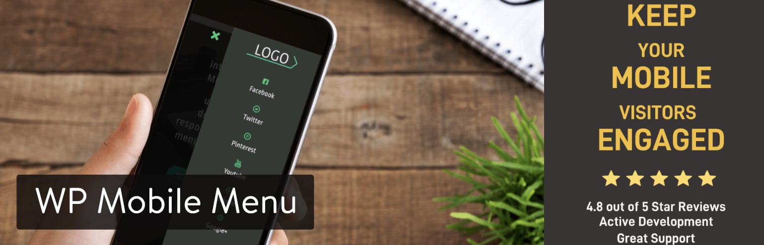
WP Mobile Menu is a plugin designed to enhance the mobile navigation experience on WordPress websites. It allows you to create a mobile-friendly menu that is easy to use and navigate on touch devices. The plugin offers a range of customization options, allowing you to design a mobile menu that matches your website’s branding and design aesthetic.
Key Features:
1. Customizable Menu Styles and Animations: WP Mobile Menu offers a variety of menu styles and animations to choose from, allowing you to create a menu that fits your website’s design. You can customize the menu’s colors, fonts, and layout to match your brand identity.
2. Support for Multi-Level Menus: The plugin supports multi-level menus, allowing you to create complex navigation structures for your mobile site. This feature helps users easily find the content they are looking for, improving the overall user experience.
3. Integration with WordPress Customizer: WP Mobile Menu integrates seamlessly with the WordPress Customizer, making it easy to customize your mobile menu. You can preview changes in real-time, ensuring that your menu looks and functions as intended.
4. Compatibility with Various WordPress Themes: WP Mobile Menu is compatible with a wide range of WordPress themes, ensuring that it works seamlessly with your website’s design. Whether you have a simple blog or a complex e-commerce site, WP Mobile Menu can enhance the mobile navigation experience for your visitors.
5. Easy to Use and Configure: The plugin is easy to use and configure, with a user-friendly interface that allows you to create a mobile menu in minutes. You can add menu items, adjust settings, and preview your menu’s appearance without any coding knowledge.
6. Improved Mobile Navigation Experience: By using WP Mobile Menu, you can significantly improve the mobile navigation experience on your website. The plugin’s responsive design ensures that your menu looks great and functions well on all devices, leading to higher user engagement and satisfaction.
6. Max Mega Menu
Max Mega Menu is a feature-rich plugin that allows you to create responsive mega menus for your WordPress website. Mega menus are large dropdown menus that can display a wealth of information in a structured and organized manner. Max Mega Menu makes it easy to create and customize these menus, ensuring that they are visually appealing and user-friendly on both desktop and mobile devices.
Key Features:
1. Drag-and-Drop Menu Builder: Max Mega Menu features a drag-and-drop menu builder that allows you to create complex, multi-level menus with ease. You can add menu items, rearrange them, and create submenus with just a few clicks, making it easy to customize your menu’s structure.
2. Support for Multiple Menu Locations: The plugin supports multiple menu locations, allowing you to create different menus for different sections of your website. This feature is useful for websites with a large amount of content, as it allows you to create targeted menus for specific sections of your site.
3. Customizable Menu Styles and Animations: Max Mega Menu offers a range of customizable menu styles and animations, allowing you to create a menu that matches your website’s design aesthetic. You can customize the menu’s colors, fonts, and layout to create a unique and visually appealing menu.
4. Accessibility Features: The plugin includes accessibility features such as keyboard navigation and screen reader support, ensuring that your mega menu is accessible to all users, including those with disabilities.
5. Compatibility with WordPress Themes and Plugins: Max Mega Menu is compatible with a wide range of WordPress themes and plugins, ensuring that it works seamlessly with your website’s design and functionality. Whether you have a simple blog or a complex e-commerce site, Max Mega Menu can enhance your menu’s functionality and appearance.
6. Responsive Design: Max Mega Menu is fully responsive, meaning that your mega menu will look great and function well on all devices, including desktops, tablets, and smartphones. This ensures that your menu is accessible to all users, regardless of the device they are using.
7. AppPresser
AppPresser is a unique WordPress plugin that allows you to create mobile apps for your website. While not a traditional mobile responsiveness plugin, AppPresser enables you to build native mobile apps for both iOS and Android platforms. These apps can provide a more optimized and immersive experience for mobile users, enhancing engagement and user satisfaction.
Key Features:
1. Build Native Mobile Apps: AppPresser allows you to build native mobile apps for iOS and Android platforms using your WordPress website as the backend. This enables you to create a custom mobile experience that is tailored to your brand and content.
2. WordPress Integration: The plugin integrates seamlessly with WordPress, allowing you to pull content from your website into your mobile app. This ensures that your app is always up-to-date with the latest content from your website.
3. Customizable App Design and Functionality: AppPresser offers a range of customization options for your mobile app, including the ability to customize the app’s design, layout, and functionality. You can add features such as push notifications, offline content, and user authentication to create a unique and engaging mobile experience.
4. Push Notifications: AppPresser includes support for push notifications, allowing you to send targeted messages to your app users. This can help increase user engagement and drive traffic to your website.
5. Improved User Engagement: By providing a native mobile app experience, AppPresser can help increase user engagement with your content. Native apps are often faster and more responsive than mobile websites, leading to higher user satisfaction and retention.
6. Monetization Options: AppPresser offers a range of monetization options for your mobile app, including support for ads, in-app purchases, and subscription services. This can help you generate revenue from your app and increase your return on investment.
Tips for Optimizing Mobile Responsiveness
Mobile responsiveness is crucial for providing a seamless user experience on smartphones and tablets. Here are detailed tips to optimize your website for mobile devices:
1. Use a Responsive Design:
Implement a responsive design framework like Bootstrap or Foundation to ensure your website adapts to different screen sizes.
Use CSS media queries to apply different styles based on the device’s screen width, ensuring content is displayed optimally.
2. Optimize Images:
Compress images to reduce file size without compromising quality, using tools like Photoshop, TinyPNG, or online services.
Use the correct image formats (e.g., JPEG for photographs, PNG for graphics) and consider using responsive images that are appropriately sized for different devices.
3. Minimize HTTP Requests:
Reduce the number of elements on your pages that require separate HTTP requests, such as images, scripts, and stylesheets.
Combine files where possible and use CSS sprites to reduce the number of images loaded.
4. Enable Browser Caching:
Set up browser caching to store static resources on visitors’ devices, reducing the need to re-download them on subsequent visits and speeding up page loading times.
5. Reduce Server Response Time:
Optimize your server configuration, use a fast web host, and enable caching to reduce server response times, especially for mobile users who may have slower connections.
6. Implement Accelerated Mobile Pages (AMP):
Consider implementing AMP to create faster-loading versions of your pages specifically designed for mobile devices. AMP can improve your site’s performance and mobile user experience.
7. Prioritize Above-the-Fold Content:
Ensure that the most important content, known as above-the-fold content, loads quickly and is visible without the need to scroll. This keeps users engaged while the rest of the page loads.
8. Use Mobile-Friendly Fonts and Typography:
Choose fonts that are legible on small screens and use appropriate font sizes and line spacing for readability.
Avoid using fonts that require additional downloads or may not be supported on all devices.
9. Optimize Touchscreen Interactions:
Make sure that buttons, links, and other interactive elements are large enough and have enough space around them to be easily tapped with a finger.
Avoid using hover effects that are not compatible with touchscreens.
10. Test Across Multiple Devices:
Test your website across a range of devices and screen sizes to ensure that it looks and functions well on all of them.
Consider using tools like Google’s Mobile-Friendly Test to identify and fix any issues.
By following these detailed tips, you can optimize your website for mobile responsiveness and provide a better user experience for visitors using smartphones and tablets.
Conclusion
In the fast-paced digital world, ensuring your website is mobile-responsive is no longer just a nice-to-have—it’s essential. With the majority of internet users accessing websites via mobile devices, providing a seamless and enjoyable mobile experience is key to engaging and retaining visitors. The seven WordPress mobile plugins discussed in this article offer a range of features to help you achieve this goal.
WPtouch stands out for its simplicity and effectiveness in creating a mobile-friendly version of your website. It provides a quick and easy solution for ensuring your site looks great on smartphones and tablets without the need for complex coding.
AMP for WP is a powerful tool for optimizing your site’s performance on mobile devices. By creating Accelerated Mobile Pages (AMP), you can significantly improve loading times and user experience, particularly for mobile users with slower internet connections.
Jetpack by WordPress.com offers a comprehensive suite of features, including mobile-friendly themes and image optimization, making it a great all-in-one solution for improving mobile responsiveness.
WordPress Mobile Pack is another excellent choice, offering a range of mobile-specific features such as a mobile switcher, touch-friendly design elements, and mobile analytics to help you understand and optimize your mobile traffic.
WP Mobile Menu enhances the mobile navigation experience by providing customizable menu styles and animations, making it easy for users to navigate your site on touchscreens.
Max Mega Menu is ideal for sites with complex navigation structures, offering a drag-and-drop menu builder and support for multi-level menus to ensure your site is easy to navigate on mobile devices.
AppPresser takes mobile responsiveness to the next level by allowing you to create native mobile apps for iOS and Android platforms, providing a more immersive and engaging experience for your mobile users.
In conclusion, choosing the right mobile plugin depends on your specific needs and goals. Whether you’re looking to create a mobile-friendly version of your site, optimize performance, enhance navigation, or create native mobile apps, there’s a WordPress mobile plugin that can help you achieve your objectives. By investing in mobile optimization, you can ensure your site is accessible and engaging to mobile users, helping you attract and retain visitors in today’s mobile-first world.
If you enjoyed this article, then you’ll love Zalvis's WordPress Hosting platform. Turbocharge your website and get 24/7 support from our veteran team. Our world-class hosting infrastructure focuses on auto-scaling, performance, and security. Let us show you the Zalvis difference! Check out our plans.


