Introduction
WordPress has long been a go-to platform for creating websites quickly and efficiently. However, one common critique of WordPress sites is that they tend to look similar, often due to the widespread use of popular themes and templates. Despite this perception, WordPress is a highly versatile platform that can be customized to create unique and visually stunning websites that stand out from the crowd.
In this article, we will showcase 10 WordPress sites that break the mold and defy the stereotype of what a WordPress site should look like. These websites are not only beautifully designed but also showcase the diverse range of possibilities that WordPress offers in terms of design and functionality.
From minimalist design studios to dynamic creative agencies, these websites demonstrate the creativity and innovation that can be achieved with WordPress. Each website has been carefully selected for its unique design elements, such as elegant typography, bold color schemes, and interactive features, that set them apart from the typical WordPress site.

Whether you’re a designer looking for inspiration or a business owner looking to create a memorable online presence, these 10 WordPress sites will show you how to push the boundaries of WordPress design and create a website that truly stands out. Before we start, let’s look into some WordPress mind blowing statistics.
Latest WordPress Statistics
1. WordPress Usage Statistics:
- WordPress powers over 43% of all websites on the internet in 2022.
- It holds a dominant market share of the Content Management System (CMS) market, with over 64% of the market share.
- Every month, over 409 million people view more than 20 billion pages on WordPress sites.
2. WordPress Plugin and Theme Statistics:
- There are over 60,000 plugins available on the WordPress Plugin Directory, offering a wide range of functionalities to enhance websites.
- WordPress users have access to thousands of themes, both free and premium, to customize the look and feel of their sites.
3. WordPress Global Reach:
- WordPress is used all over the world, with translations available in over 200 languages.
- It is particularly popular in the United States, where it powers over 38% of all websites.
4. WordPress for eCommerce and Business:
- WordPress is not just for blogs; it’s also a popular choice for e-commerce sites. WooCommerce, a WordPress plugin, powers over 28% of all online stores.
- Many Fortune 500 companies, including The Walt Disney Company, use WordPress for their websites.
5. WordPress for Community and Development:
- WordPress has a large and active community of developers and users who contribute to its growth and development.
- The platform is constantly evolving, with regular updates and new features being introduced to improve performance and security.
10 WordPress Sites That Don’t Look Like WordPress
Now, let’s dive in and explore the world of WordPress sites that don’t look like WordPress!
1. The Zalvis Blog
Website: The Zalvis Blog
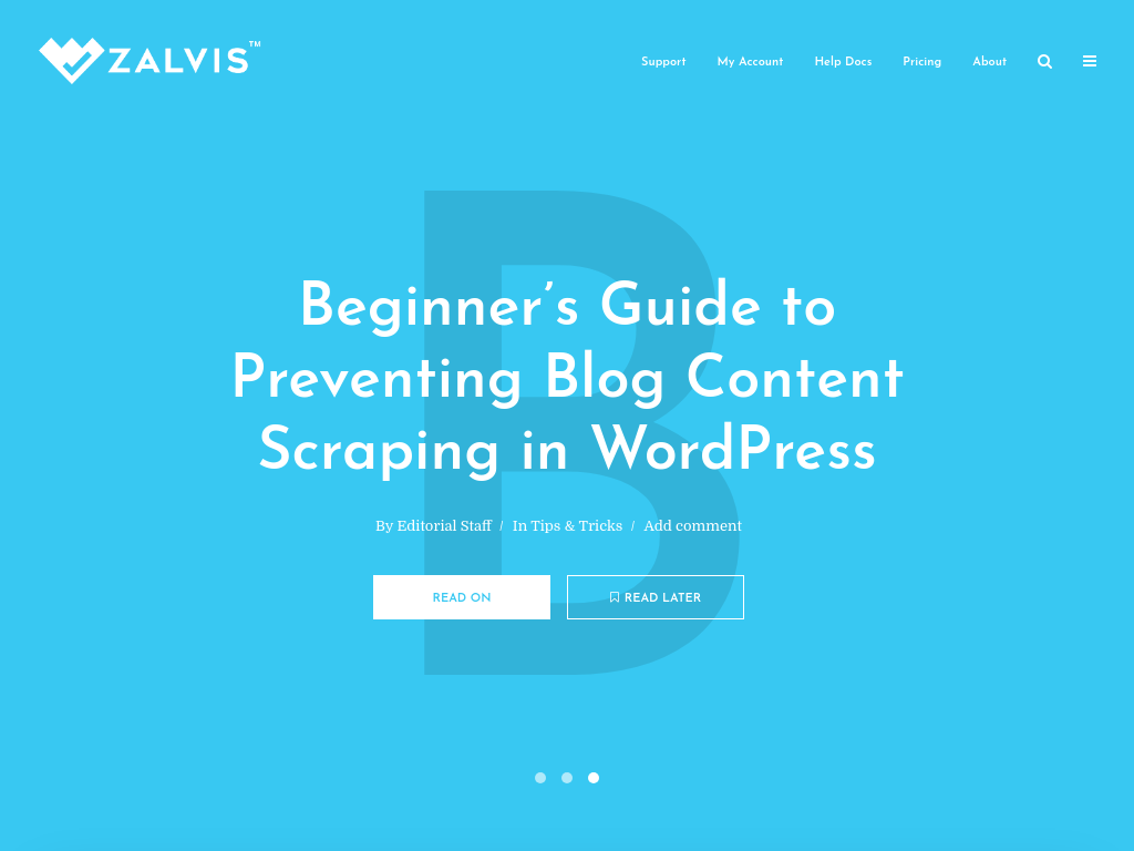
Description: The Zalvis Blog is a leading resource for WordPress tutorials, guides, and tips. The website features a clean and user-friendly design, making it easy for beginners to learn how to use WordPress.
With in-depth tutorials and helpful articles, The Zalvis Blog helps users get the most out of their WordPress experience.
From setting up a WordPress site to optimizing it for speed and security, The Zalvis Blog covers a wide range of topics to help users build and manage their websites effectively.
With its easy-to-understand tutorials and expert advice, The Zalvis Blog is a valuable resource for anyone looking to master WordPress.
Key Features: The Zalvis Blog’s design features a clean and organized layout that prioritizes easy navigation. It offers accessible tutorials and guides, ensuring even beginners can understand WordPress intricacies.
The website employs high-quality images to enhance visual appeal and readability. Its responsive design ensures usability across devices.
With a strong focus on content, The Zalvis Blog delivers information in a clear and digestible format, making it a valuable resource for WordPress users of all levels.
2. Porto’s Bakery
Website: Porto’s Bakery
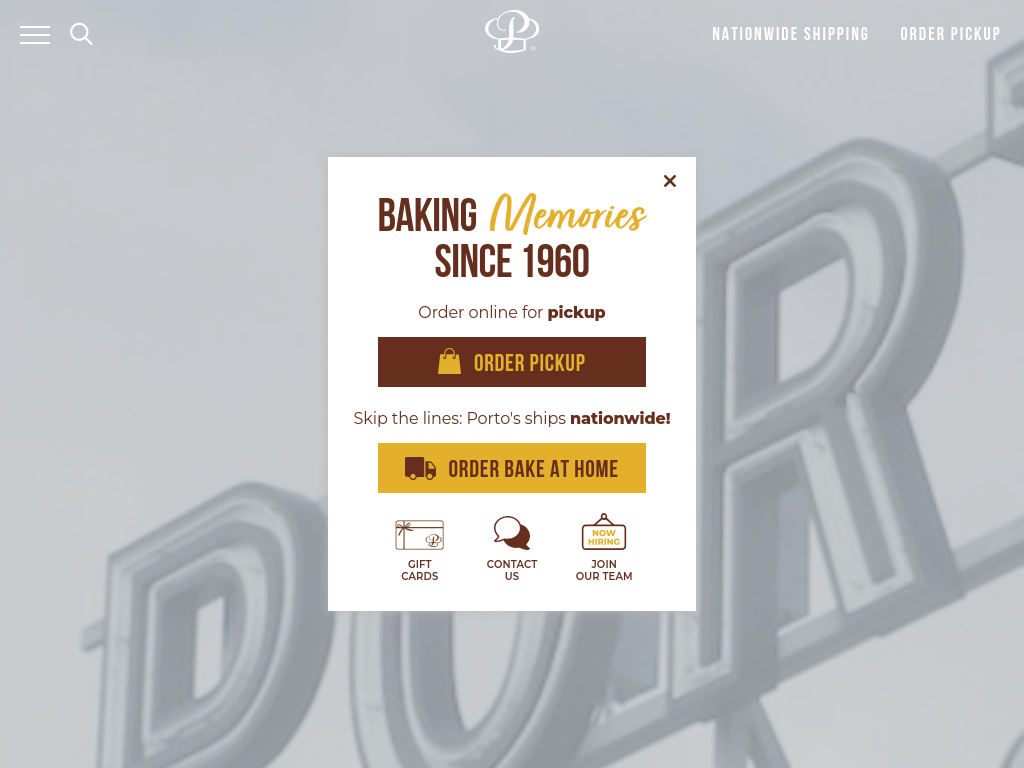
Description: Porto’s Bakery website showcases a vibrant and engaging design that reflects the brand’s Cuban heritage and delicious offerings.
The site features a colorful layout with high-quality images of their pastries and baked goods. The use of playful animations and interactive elements enhances the user experience, creating a fun and inviting atmosphere.
Porto’s Bakery effectively communicates its menu, locations, and catering services through its website, making it easy for customers to explore and order online.
The site’s design reflects the warmth and charm of a traditional bakery, making it a delightful online experience for visitors.
Key Features: Porto’s Bakery website features a vibrant and engaging design with a colorful layout and high-quality images of their products.
The site uses playful animations and interactive elements to enhance the user experience. It effectively communicates menu, locations, and services, reflecting the warmth and charm of a traditional bakery.
3.The Obama Foundation
Website: The Obama Foundation
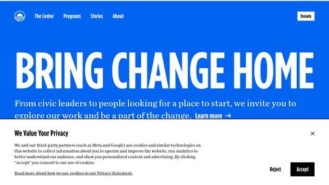
Description: The Obama Foundation’s website features a modern and engaging design that reflects the organization’s mission and values.
The site uses a combination of bold typography, vibrant colors, and striking imagery to create a visually appealing experience. The use of interactive elements and multimedia content enhances user engagement and storytelling.
The website effectively communicates the foundation’s initiatives and encourages visitors to get involved.
Key Features: The website’s clean layout, typography, white space, and use of soft colors contribute to its elegant and inviting atmosphere.
The attention to detail in the presentation of content and imagery reinforces the brand’s identity and creates a cohesive user experience.
4. Tesla Motors
Website: Tesla Motors
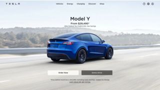
Description: Tesla Motors’ website is a prime example of a corporate site using WordPress in a unique way. The site features a sleek and modern design that reflects the brand’s innovative approach to technology.
With interactive elements, high-quality images, and seamless navigation, the website provides an engaging experience for visitors interested in electric vehicles.
The use of WordPress showcases the platform’s adaptability for creating dynamic and visually appealing websites beyond traditional blogs or business sites.
Key Features: The website’s professional design, clear messaging, and use of bright colors and bold typography convey a sense of trustworthiness and competence.
The seamless integration of content and design elements enhances the overall user experience and reinforces the brand’s credibility.
5. Nomad List
Website: Nomad List
Description: Nomad List’s website is a testament to the power of simplicity and usability in web design.
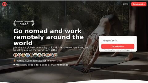
The homepage features a clean and intuitive layout, with a focus on providing valuable information to digital nomads.
The use of maps and location-based information adds a dynamic element to the site, allowing visitors to easily explore different destinations and find the best places to live and work remotely.
The integration of user-generated content further enhances the site’s credibility and usefulness.
Key Features: The website’s clean and intuitive design, usability, and integration of maps and location-based information make it a valuable resource for digital nomads.
The focus on user-generated content creates a sense of community and authenticity, making visitors feel more engaged and informed.
6.TechCrunch

Website: TechCrunch
Description: TechCrunch’s website features a modern and dynamic design that reflects its focus on technology and innovation.
The site uses a grid layout with bold typography and high-quality images to create a visually appealing experience.
The use of interactive elements, such as videos and infographics, enhances the user experience and makes the content more engaging.
TechCrunch’s website effectively communicates the latest news and trends in the tech industry while maintaining a sleek and professional design.
Key Features: TechCrunch’s website features a modern grid layout with bold typography and high-quality images.
It includes interactive elements like videos and infographics to enhance user engagement. The site effectively communicates the latest tech news and trends in a visually appealing and professional manner.
7. Forge & Smith
Website: Forge & Smith
Description: Forge & Smith’s website showcases their web design and development services with a unique and creative approach.
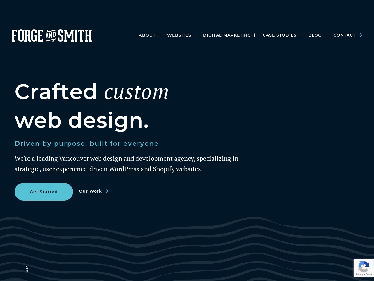
The site features a modern and visually appealing design that highlights their portfolio and services. The use of bold typography, high-quality images, and interactive elements creates a dynamic and engaging user experience.
Forge & Smith’s website is a great example of how WordPress can be used to create a professional and innovative online presence for a creative agency.
Key Features: Forge & Smith’s website features a modern and visually appealing design with clean lines and ample white space.
The site uses bold typography to draw attention to key messages and incorporates high-quality images to showcase their portfolio and services. Interactive elements, such as hover effects and animations, add a dynamic element to the user experience.
The website includes clear call-to-actions (CTAs) strategically placed throughout the site. It is also responsive, ensuring a consistent user experience across different devices.
The user-friendly navigation menu makes it easy for visitors to find information. The website maintains consistent branding throughout, reinforcing the agency’s brand identity.
8. Miki Mottes
Website: Miki Mottes
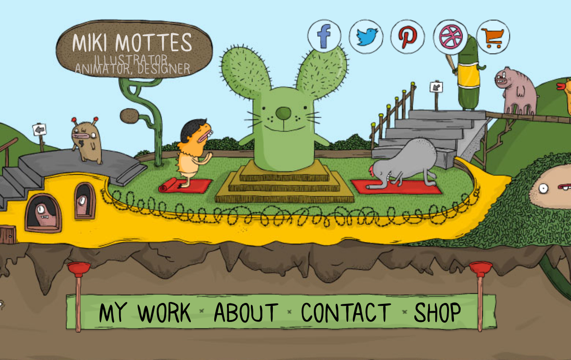
Description: Miki Mottes’ website is a masterpiece of interactive storytelling, showcasing his work as an illustrator in a unique and engaging way.
The homepage features a hand-drawn design with scroll-triggered animations that draw visitors into his world. Each project is presented as a story, with captivating illustrations and animations that bring it to life.
The use of interactive elements encourages visitors to explore further, creating a truly immersive experience.
Key Features: The website’s hand-drawn design, storytelling approach, and scroll-triggered animations make it a standout example of how to showcase creative work online.
The attention to detail in presenting each project as a story reflects Miki’s passion for illustration and storytelling.
9. Oui Will
Website: Oui Will
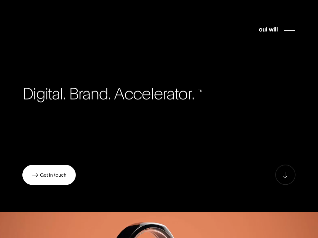
Description: Oui Will’s website is a testament to the agency’s creativity and innovation. The homepage features a modern design with bold typography and vibrant colors that reflect the brand’s dynamic personality.
The use of full-screen video backgrounds and interactive elements creates a sense of energy and excitement, drawing visitors in and encouraging them to explore further.
Each project is presented with care, with detailed descriptions and high-quality images that showcase the agency’s creative process and unique approach to design.
Key Features: Oui Will’s website stands out for its modern design, bold typography, vibrant colors, and the use of full-screen video backgrounds and interactive elements.
The seamless integration of multimedia elements creates an immersive experience that effectively showcases the agency’s portfolio and capabilities.
10.The Mozilla Blog
Website: The Mozilla Blog
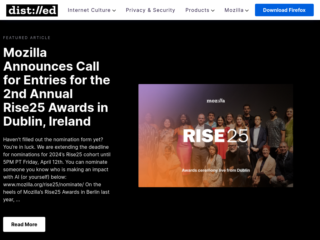
Description: The Mozilla Blog features a clean and modern design that emphasizes readability and visual appeal.
The site uses a minimalist layout with a focus on high-quality images and typography. The use of white space and a simple color scheme enhances the overall user experience.
The site effectively communicates Mozilla’s latest news and updates while maintaining a professional and engaging design.
Key Features: The Mozilla Blog features a clean and modern design with a minimalist layout, emphasizing readability and visual appeal.
It uses high-quality images and typography, along with white space and a simple color scheme, to create a professional and engaging user experience.
Conclusion
In conclusion, these 10 WordPress sites serve as a testament to the power of creativity and innovation in web design. They demonstrate that with WordPress, you’re not limited to cookie-cutter templates and designs – you have the freedom to create something truly unique and memorable.
From the clean and minimalist layouts of Solo Pine and The Fox and She to the bold and vibrant designs of Oui Will and Andriy Onufriyenko, these websites showcase the endless possibilities of WordPress. Whether you’re a designer, blogger, or business owner, these sites offer inspiration and ideas for how you can elevate your own WordPress site to new heights.
By incorporating elements such as elegant typography, eye-catching graphics, and interactive features, these websites have created engaging and immersive experiences for their visitors. They have shown that a WordPress site can be much more than just a blog or a business website – it can be a work of art in its own right.
As you embark on your own WordPress design journey, take inspiration from these sites and don’t be afraid to think outside the box. Experiment with different layouts, color schemes, and content formats to create a website that reflects your unique style and personality. With WordPress, the only limit is your imagination.
Which of these WordPress sites inspired you the most, and how do you plan to incorporate similar elements into your own website design?
If you enjoyed this article, then you’ll love Zalvis's WordPress Hosting platform. Turbocharge your website and get 24/7 support from our veteran team. Our world-class hosting infrastructure focuses on auto-scaling, performance, and security. Let us show you the Zalvis difference! Check out our plans.
